Marketing essentials for an FMCG brand in the Iran market
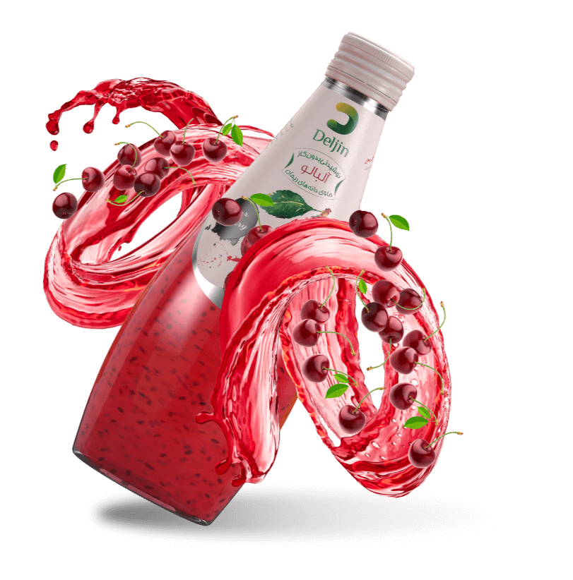
This brand would provide specific fruit juices that contained basil seeds. At the time this brand, Deljin, would be the only one offering this twist, as twist that previously would only be a home-made drink. Our challenge was to first create a brand solution for Deljin to sparkle in the market, then devise a packaging and label solution that would best present this unique product.